Luxury Escapes’ first ever seat, meal, and extra baggage selection, one experience across every airline partner, on web and app.
Customers booking flights on Luxury Escapes had to visit airline websites post-booking to select seats and other services. A fragmented experience that eroded trust and handed a key moment in the journey to a third party.
I designed Luxury Escapes’ first flight services experience, researching airline platforms, synthesising findings, running usability testing with 6 real customers, and delivering dev-ready files.
SUS score 83.68, A− Excellent. 61% charter flight seat uptake. Live across web and app with Virgin Australia, Malaysia Airlines, and Garuda integrations fully supported.
Luxury Escapes sells flights. Customers wanting to select seats, meals and add extra baggage had to manage all of it on airline platforms, post-booking.
Customers expect to manage everything in one place, not bounce between sites.
It split the customer journey across different environments and brands.
Seat upgrades, extra legroom and cancellation fees all went to the airline, not Luxury Escapes.
Used internal booking references to experience the post-booking flow on airline sites: seat selection, meals, baggage, exactly as a customer would.
Instructed an AI agent to review airline seat selection flows and compile a synthesis of patterns, pain points, and conventions across 12 major carriers.
Designed desktop and mobile prototypes in Figma on the Luxury Escapes design system (LuxKit) with minimal custom components.
Ran moderated usability testing with 6 real Luxury Escapes customers, captured SUS scores, and delivered dev-ready files.
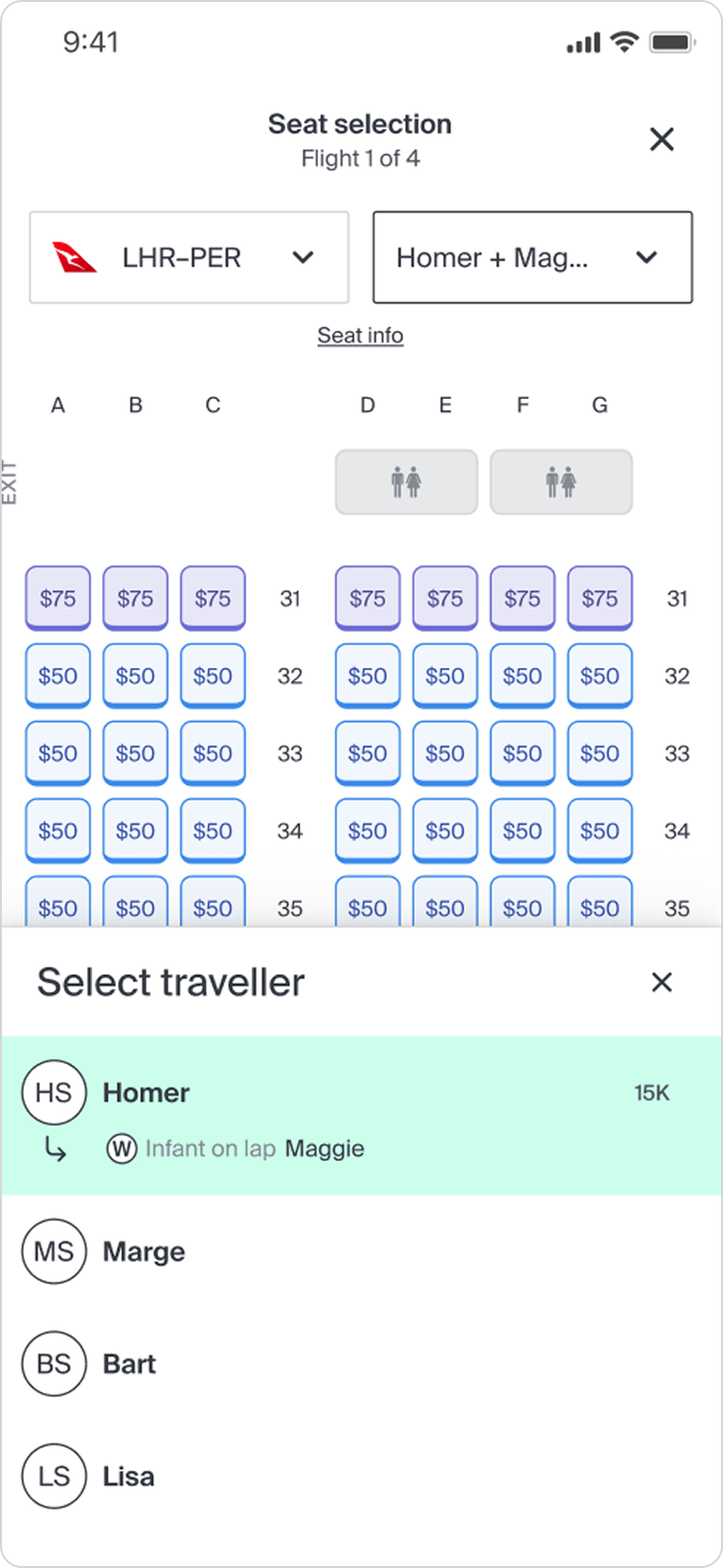
Most platforms make customers fill in passenger details before they can even see available seats. For a family of four, that’s a lot of upfront effort before you’ve picked anything.
A known problem we couldn’t solve at launch: passenger details were technically required before seat selection. The complexity was scoped out of v1 and scheduled as a fast follow.
Most platforms either shrink everything so small it’s impossible to tap the right seat, or make you scroll in two directions at once: left-right and up-down.
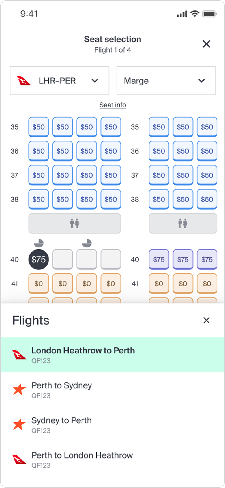
Go with two-directional scrolling: the most common pattern customers already know. It keeps seats a tappable size without redesigning the whole map for mobile.
Many platforms try to recreate seat shapes in the UI. It adds visual noise and complexity with little user benefit.
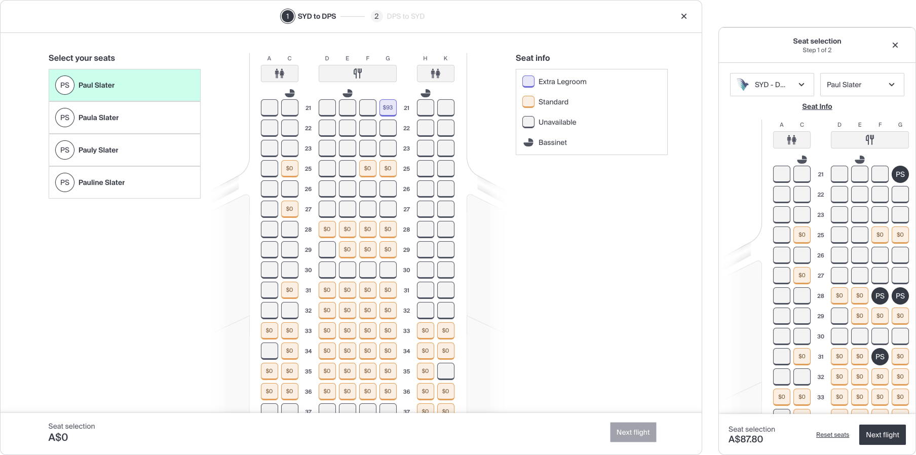
Keep it simple. Show seats as colour-coded blocks with pricing. Easy to read, consistent across configs, works at any screen size.
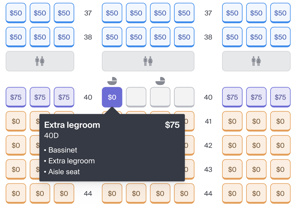
Seats shown as simple colour-coded blocks, not illustrations. Easy to read, consistent across configs, works at any screen size.
Colour and price on every seat, so the value is legible at a glance.
Same components on desktop and mobile. Build once, consistent experience everywhere.
Some of the most complex design problems had nothing to do with the seat map itself.
Infants under 2 often travel on a parent’s lap. Most systems don’t show the baby as a separate person, so parents can’t tell if they’ve been accounted for.
Show the infant as their own listed traveller, just like on the post-booking summary page.
Bulkhead rows sit directly behind the cabin dividers, with more legroom, often free. But most platforms bury them or make them invisible on the map.
Label bulkhead rows explicitly and show why they’re different. The child next to a stranger scenario is a real anxiety for family bookings.
Desktop and mobile prototypes built on the Luxury Escapes design system with minimal custom components, covering flight service entry points, seat and meal selection, extra baggage and manage booking.
6 real Luxury Escapes customers: 5 sessions over video call, 1 in person
Select seats, choose meals, add baggage, change dates, cancel a flight
Clickable Figma prototype simulating a return economy Qantas flight, Sydney to London
| Participant | SUS | Grade |
|---|---|---|
| Andrew T | 100.0 | A+ Perfect |
| Lynn B | 75.0 | B Good |
| Mary Z | 72.9 | B− Good |
| Sing C | 95.8 | A Excellent |
| Claire S | 77.1 | B Good |
| Stuart F | 81.3 | A− Excellent |
| Group average | 83.68 | A− Excellent |
We tested two ways customers could reach flight services. The checkout summary view showed high-level labels before payment. The My Escapes view showed a granular, per-traveller breakdown post-booking. The difference in confidence was immediate.
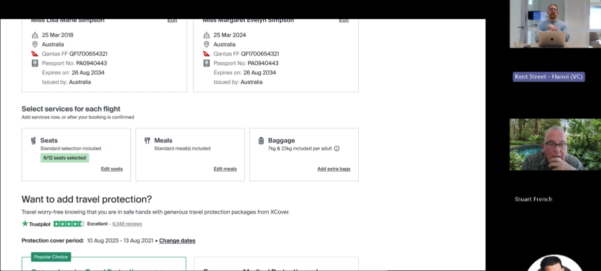
Services displayed as high-level labels: '6 of 12 seats selected', 'Standard meal'. Participants could not confirm per-traveller allocations, reducing confidence to complete payment.
"I wouldn't be confident to check out here. I'd want to know what I'm locking in." Claire
.webp)
Post-booking view showing a detailed, per-traveller breakdown of every seat, meal, and baggage allocation. Rated a hit by all 6 participants. Recommendation: bring this level of detail into checkout.
"Much better... there's no question about what's been booked." Stuart
Charter flight uptake: nearly 2 in 3 customers select a seat when the experience is live end to end.
Virgin Australia and Malaysia Airlines, where integrations are fully supported.
Garuda: another fully supported commercial integration live at launch.
Across all other supported airline partners at initial rollout.
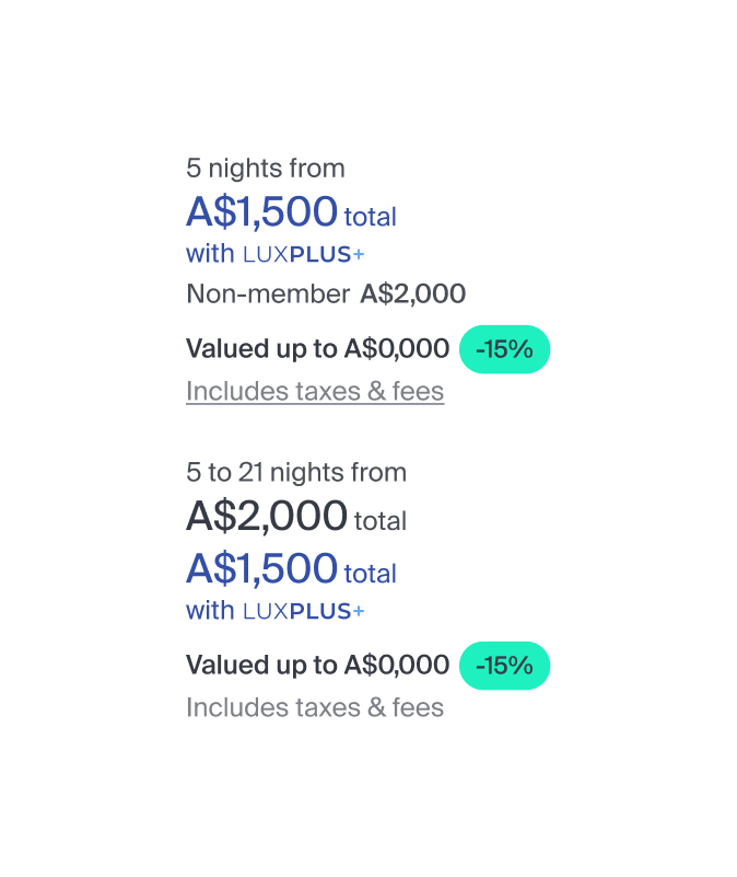

Member discounts blended into surrounding pricing information. I simplified the hierarchy and validated it through testing.The winning variant delivered a measurable conversion uplift.


I conducted qualitative research that revealed novice buyers lacked confidence when evaluating vehicles. Workshops and testing helped translate insights into action.

